The Monochrome Logo: 1998 - Present
TInkering with one of the most recognizable logos in the world wasn’t done simply because Steve Jobs is always looking to change things up. When Jobs returned to Apple in 1997, the company was bleeding money, and Jobs and Co. realized that the Apple logo could be leveraged to their advantage. That meant experimenting with larger logos to make it more prominent. If the shape of the Apple logo was universally recognizable, why not not put it where people could see it?
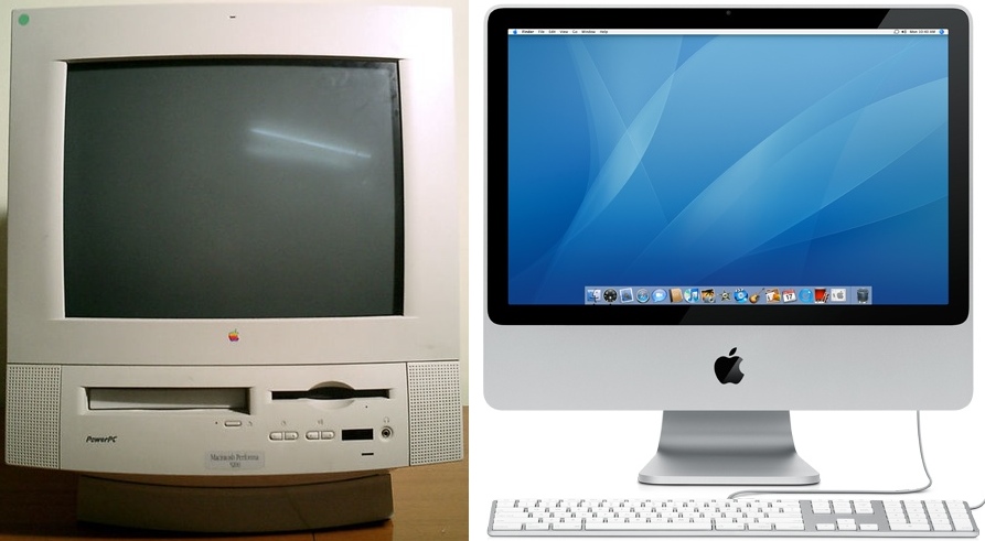
That being the case, placing a large rainbow Apple logo on top of the original Bondi Blue iMac, for example, would have looked silly, childish, and out of place. Not exactly the direction Jobs wanted to lead Apple in. So instead of placing a somewhat minuscule rainbow colored Apple logo on its products, Apple began placing sizeable and Monochrome styled logos on its products in all sorts of places: on top of the original iMac, on the side of the Powermac G3 Tower, and in an assortment of colors on the good ole iBooks. This trend, which began in 1998, continues to this day.
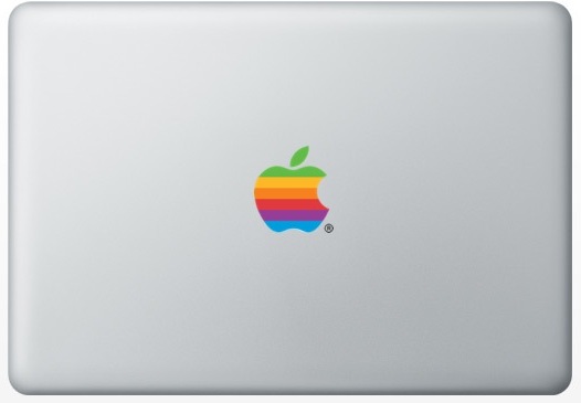
The rainbow colored logo might always be a source of nostalgia for Mac enthusiasts, but the monochrome logo allows Apple greater flexibility when it comes to branding its products. Also, Steve Jobs isn’t exactly the type to get wrapped up in warm fuzzy feelings of nostalgia. When Jobs returned to Apple, he needed to transform Apple’s image from that of a failing company into one capable of churning out sleek and cutting edge products, and he needed a new logo to match. It doesn’t appear likely that Apple will change up its logo again anytime soon, but one thing that will undoubtedly remain is the shape of the logo itself.
Why Apple had to abandon the rainbow
The rainbow logo just wouldn’t fit on the iMac pictured to the right. Rainbow on beige? Alright. Rainbow on metal? Not so much.


